Product Comparison Charts: How to Make Yours Win
Product comparison charts are one of the most underutilized yet high-impact tools in eCommerce. When done correctly, they remove buyer hesitation, highlight value over price, and quietly guide customers toward the product you want them to choose—without sounding salesy.
Whether you’re optimizing Amazon A+ Content, a Shopify product page, or a Walmart PDP, a well-designed comparison chart can dramatically improve conversion rates, reduce returns, and increase average order value. This guide breaks down how to create comparison charts that actually convert, not just decorate a page.
Why Product Comparison Charts Matter More Than Ever
Today’s shoppers are overwhelmed with choice. They skim, compare, and decide quickly. A strong comparison chart meets that behavior head-on by doing the thinking for them.
On marketplaces like Amazon, comparison charts are especially powerful because they:
Clarify differences between similar SKUs
Reduce decision fatigue
Reinforce perceived value without discounting
Encourage upsells within your own catalog
According to Amazon’s own guidance on A+ Content best practices, comparison charts are one of the most effective modules for increasing time on page and purchase confidence. When customers can instantly see why one product fits their needs better than another, they’re far more likely to convert.
What Makes a Product Comparison Chart “Winning”
Not all comparison charts work. In fact, poorly designed charts can hurt conversions by overwhelming or confusing shoppers. Winning charts share a few key traits.
1. They Focus on Customer Priorities, Not Features
A common mistake is listing every technical detail instead of what actually matters to the buyer. Customers don’t want specs—they want clarity.
Instead of:
“480 ml bottle”
Use:
“Ideal for daily use”
“Best for family households”
“Travel-friendly size”
This aligns with how platforms like Shopify recommend framing product information around benefits rather than attributes. Your chart should answer the silent question: “Which one is right for me?”
2. They Compare Products Within the Same Brand or Collection
The most effective charts compare your own products, not competitors. This keeps shoppers inside your ecosystem and positions your brand as transparent and helpful.
Amazon explicitly discourages competitor comparisons in A+ Content, but strongly supports side-by-side comparisons of parent-child variations, bundles, or tiered offerings. A great example is comparing:
Standard vs. premium versions
Single units vs. multi-packs
Entry-level vs. giftable options
This strategy mirrors what high-performing DTC brands do on Shopify product pages, where internal comparison tables are used to drive customers toward higher-margin SKUs without aggressive selling.
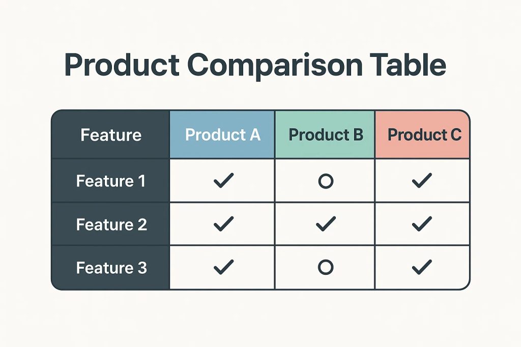
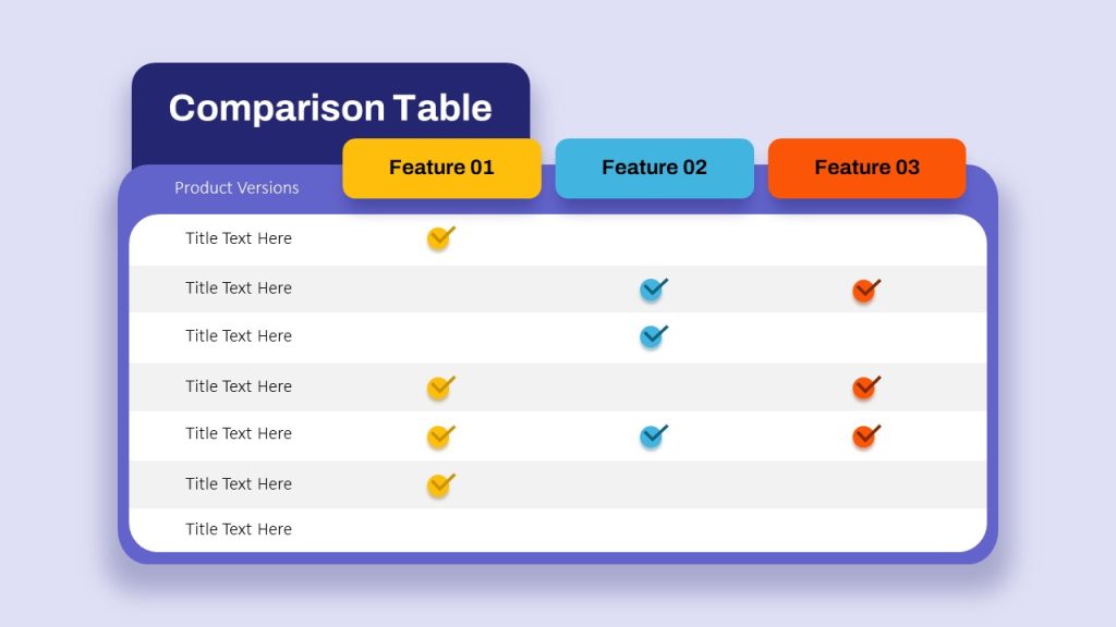
How to Structure a High-Converting Comparison Chart
A winning comparison chart is scannable, visually balanced, and easy to interpret in under five seconds.
Recommended Structure
Columns: Product options (limit to 3–4 max)
Rows: Key differentiators that matter to buyers
Visual cues: Checkmarks, icons, or short phrases
Clear winner: Subtle emphasis on the best-fit option
Avoid clutter. Fewer rows with stronger messaging outperform long, spec-heavy charts almost every time.
Platforms like Walmart Marketplace emphasize clarity and mobile-first readability, which is critical—most shoppers will view your chart on a phone.
What to Include (and What to Leave Out)
High-Impact Comparison Points
Intended use case (daily use, gifting, travel)
Size or quantity category (not raw dimensions)
Ideal customer type
Compatibility or versatility
Value indicators (bundle, refillable, reusable)
What to Avoid
Redundant features shared across all products
Technical jargon
Price comparisons (especially on Amazon)
Overloaded rows that require zooming
Remember: if everything looks important, nothing looks important.
SEO Benefits of Product Comparison Charts
Beyond conversion, comparison charts can support SEO when paired with strong copy. Search engines favor pages that clearly differentiate products and help users make decisions.
When implemented alongside optimized headings and supporting text, comparison charts reinforce relevance for keywords like:
product comparison chart
compare product features
best option for [use case]
product comparison table
On Shopify, structured comparison content can also improve dwell time—an indirect ranking signal that supports organic visibility.
Where Comparison Charts Work Best
While Amazon A+ Content is the most common use case, comparison charts perform exceptionally well across platforms:
Amazon: A+ Content, Brand Story modules, storefronts
Shopify: Product pages, collection pages, landing pages
Walmart: Enhanced content sections
DTC websites: Subscription vs. one-time purchase comparisons
High-growth brands use the same core chart and adapt the design to each platform’s requirements.
Common Mistakes That Kill Conversions
Even experienced sellers make these mistakes:
Trying to compare too many products at once
Treating the chart like a spec sheet
Using inconsistent language across rows
Not clearly signaling who each product is for
If your chart doesn’t guide a decision, it’s just decoration.

Final Takeaway: Comparison Charts Are Silent Salespeople
A great product comparison chart works 24/7. It answers objections, builds confidence, and nudges customers toward the best choice—without pressure.
When aligned with customer intent, platform guidelines, and SEO strategy, comparison charts become one of the highest-ROI assets in your listing or product page toolkit.
If you’re investing in A+ Content, storefronts, or DTC optimization and not using comparison charts strategically, you’re leaving conversions on the table.