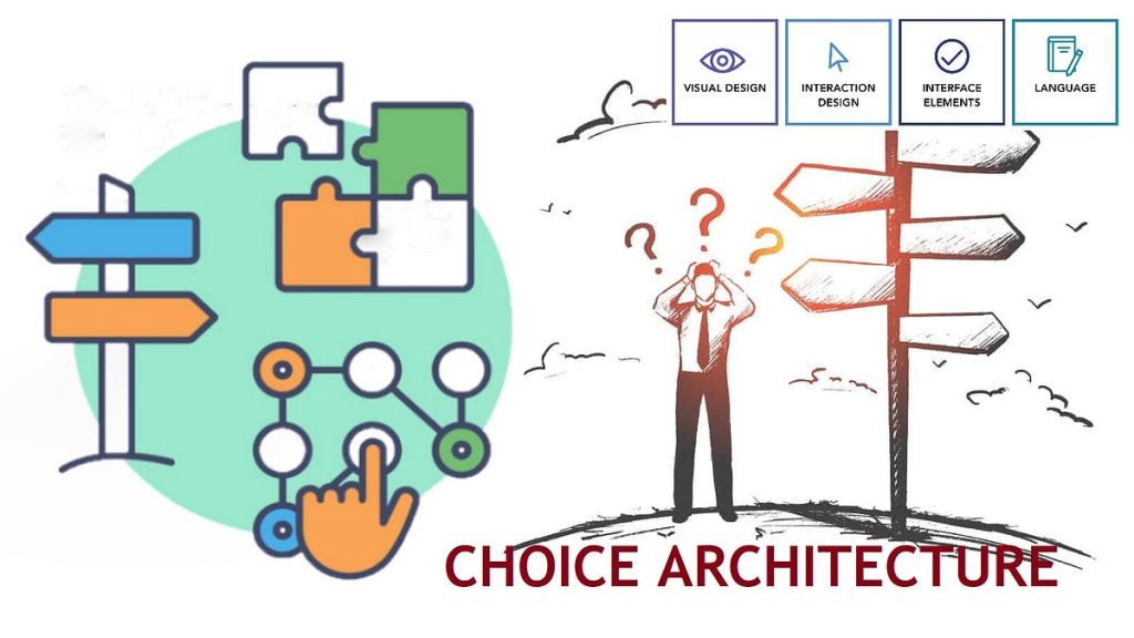
Implementing Choice Architecture to Guide Buying Decisions
In today’s crowded eCommerce landscape, success isn’t just about offering more products—it’s about guiding customers toward the right decision. That’s where choice architecture comes in. When implemented thoughtfully, choice architecture helps shoppers feel confident, reduces decision fatigue, and increases conversions without pressure or manipulation.
For brands selling online, especially on large marketplaces, mastering choice architecture can mean the difference between a stalled listing and a high-converting bestseller.
What Is Choice Architecture in eCommerce?
Choice architecture refers to how options are presented and how that presentation influences decisions. Customers rarely evaluate every option equally. Instead, they rely on cues such as defaults, comparisons, visual hierarchy, and perceived recommendations.
In eCommerce, choice architecture shows up in:
Product variations and bundles
Pricing tiers
Subscription settings
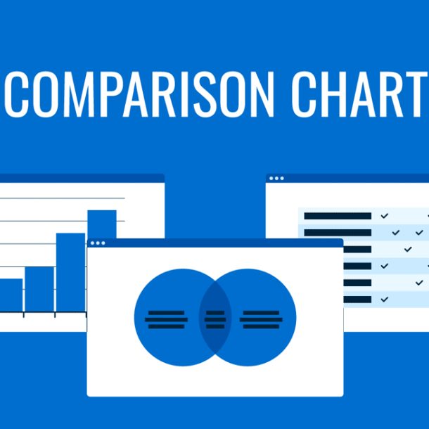
Comparison charts
Labels like “Most Popular” or “Best Value”
The goal isn’t to limit choice—it’s to structure it so the best option is easy to choose.
Why Choice Architecture Matters for Online Buyers
Modern shoppers are overwhelmed. Too many options often lead to:
Decision fatigue
Cart abandonment
Analysis paralysis
Effective choice architecture:
Speeds up purchasing decisions
Increases average order value
Improves customer satisfaction
Reduces returns caused by buyer’s remorse
Marketplaces reward listings that convert efficiently, making choice architecture both a customer experience strategy and a performance lever.
Key Choice Architecture Strategies That Drive Conversions
1. Use Smart Defaults to Reduce Friction
Defaults are powerful because many customers accept them rather than changing settings.
High-impact defaults include:
Pre-selecting the most popular size or pack
Defaulting to a subscription option
Selecting standard shipping automatically
When the default feels like a recommendation, customers feel reassured rather than pressured.
2. Limit Visible Options Without Limiting Choice
More choice does not equal better outcomes. Instead:
Show only a few core options at once
Group variations logically (for example, size before color)
Keep edge options accessible but visually secondary
This reduces cognitive overload while preserving flexibility.
3. Use Tiered Pricing to Anchor Value
Tiered pricing helps customers self-select while subtly encouraging upgrades.
A strong structure includes:
An entry-level option
A highlighted “best value” option
A premium option with added benefits
Clear value anchoring makes mid-tier choices feel like the smartest decision.

4. Make Comparisons Simple and Visual
Customers will compare options whether you help them or not. When you do:
You control the comparison
You reduce uncertainty
You shorten the decision path
Use:
Clean comparison charts
Benefit-focused bullet points
Icons or checkmarks instead of dense text
Clarity beats persuasion every time.
5. Place Social Proof at Decision Points
Social proof is most effective when it appears where hesitation occurs.
High-impact placements include:
Review callouts near pricing
Star ratings next to default selections
Purchase activity indicators near add-to-cart
These cues reassure shoppers that others have already made—and approved—the same choice.
6. Bundle to Simplify the Buying Decision
Bundles work best when they eliminate uncertainty.
Effective bundles:
Solve a complete use case
Feel curated and intentional
Offer a small perceived value advantage
The best bundles answer the customer’s unspoken question: “What else do I need?”
Common Choice Architecture Mistakes to Avoid
Even experienced brands stumble here. Watch out for:
Too many variations presented simultaneously
Pricing tiers with no meaningful differentiation
Overuse of labels that dilute credibility
Forcing urgency instead of offering guidance
Good choice architecture feels supportive, not manipulative.
How Choice Architecture Improves SEO and Marketplace Performance
Choice architecture impacts more than just user experience. It directly influences:
Conversion rate
Time on page
Bounce rate
Repeat purchase behavior
These signals affect organic visibility and advertising efficiency. Listings that help customers decide faster and with confidence tend to perform better across the board.

Final Takeaway: Design the Decision Environment
The strongest brands don’t push customers—they design environments where the right choice feels obvious.
When you implement thoughtful choice architecture:
Customers feel respected, not sold to
Trust increases naturally
Revenue grows without aggressive tactics
If your listings feel cluttered, confusing, or underperforming, the issue may not be traffic—it may be how choices are structured.